
Tableau is one of the most popular data visualization tool used by scholars, researchers, and business-people. But is that a good thing? Does data visualization give the viewer/reader an accurate picture of the information presented? Or does it allow the creator/researcher to hide flaws or omission in their data? The truth is any consolidation of information into easily-digestible chunks distorts the overall picture. Whether it be an old-fashioned line graph or bar chart, or a dynamic information web, all data visualizations focus on some data while downplaying others. Additionally, visualizations tend not to convey how data was gather or from where.
The pitfalls of data visualization aside, Tableau provides a fairly easy tool to create fun and vibrant visuals to convey information. As a traveler, and a fan of cheap trips, I found Sara Loves Data’s visualization of the cheapest cities in Europe to travel to quite interesting and engaging. For the blog post on how she assembled her visualization, go here (https://sarahlovesdata.co.uk/2018/04/03/vizzing-european-cities-for-iron-viz-europe/amp/) For the visualization alone, go here (https://public.tableau.com/profile/sarah.bartlett#!/vizhome/EuropeanCitiesonaBudget/EuropeanCitiesonaBudget)
I particularly liked her simplified use of icons for budget lines, inclusion of climate details for the best times to travel, and a clear disclosure at the top for how she evaluated the costs of a stay in each city. Her visualization provides interactivity with the user when they scroll over the climate data, as it provides the number of rainy days/month or average temperature when the visitor moves the cursor over those elements.
Starting to Use Tableau
First, you have to download Tableau. You can use the free version (but if you want to use your creations you must publish them publicly on Tableau Public). If that doesn’t float your boat, you can download and use Tableau Creator for $70/month/person. Free = Tableau Public. Come on, share your creations with the world.
The first thing you need is a dataset, and you want that to be a cleaned up dataset. What does that mean? You want consistent entries, no blanks or nulls, and clear column and row headings. As you clean up your data, you should think about how you go about doing that clean-up, how those tweaks, additions, or deletions change the data, and what those changes might do to your conclusions.
Tableau Public provides a number of sample datasets to use as you’re learning to use their software. You can find them here. You must download those files to your computer to use in the Tableau program.
When you open Tableau, and start a new project you will see this:

At this point you will want to connect your data source. Select the correct file type under the Connect list on the left side of the screen. Follow the prompts, which should lead you to this:
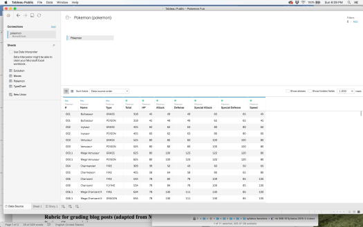
If you haven’t cleaned up your data, now is the time to do that. All set? Now, the fun begins. Click on the Sheet 1 tab at the bottom of the window. This will open up the workspace where you can begin to play with the data, and decide which information from your dataset you want to compare and contrast. This part is mainly trial and error. The more you move things around the clearer it all becomes. I chose a dataset of 633 Pokemon and their stats from the Tableau Public site. After a lot of playing around, cursing, and talking with others who’ve used Tableau in their professional experiences, I began to get a better handle on where to put things, which visualization to use, and how filter the data. First, you must move the column and row information to where you want it for your visualization. Like this:
Here I am moving the “Type of Pokemon” to the column space, so my data will organize based upon Type. Next, I move two of the other attributes that I want to show. Like this:
These “measures” won’t be displayed on the x or y axis, but rather will be conveyed by size and color, which can be changed and added like this:
Still not a very interesting or helpful graphic. At this point I also realized that the numbers the program was using were totals of these measures for each type not an average. You can change this by right clicking (two finger clicking for those fellow Mac users) on the measure, selecting measure and changing the method of calculation. Like this:
At this point, I went to the right side of the screen and began looking at the different visualizations available with these parameters. Some work better than others to display the differences between each Pokemon type. As seen here:
I went back to my initial setup, with the type in the columns and the attack and defense shown in the size and color (I also went back to SUM rather than AVG, why will soon be revealed). I then added Speed to the row space. This populated the columns with marks for all of the individual Pokemon in a particular category. Now, I had something interesting. I played with how the shapes looked by right clicking on the shape icon and playing with the options. I played with the color the same way as the shape. When I hovered over a particular mark, it did not tell you the name of the Pokemon for that particular point. I pulled over the Name “dimension” and bingo, it was all there. How beautiful is that? But wait, I learned one more trick. You can filter the data within the visualization to allow for closer comparisons. If you add a dimension to the filter box, you unlock a whole other level of comparison power. Watch here:
Finished product can be found here: Pokemon Fun
I couldn’t get the embedding to work, so you’ll have to go to the source.
While, I’m not sure that this tool will be immediately helpful in my research, I can certainly envision ways to use Tableau to help make sense of large chunks of complicated data. However, in the advantages lies a weakness, over-simplification. In the humanities, we live in the minutia, the grey area, the complexity, and exceptions. Pretty, colorful charts are fun, but only as useful as the conclusions they afford. It is those conclusions that we as curators of information must remain mindful of their limitations.
